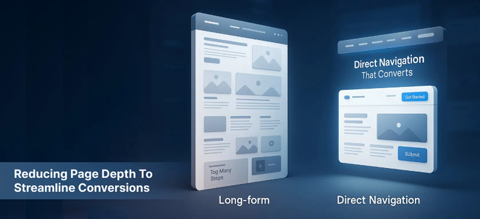
Another client’s conversion funnel was spread across multiple deep pages, creating friction as users navigated through a labyrinth of information and multiple clicks before reaching conversion points. Historical analytics indicated that the average user had to click through at least five pages before reaching a conversion point, leading to a high abandonment rate of 45% at the initial stages of the funnel.
In-depth analysis revealed that users were overwhelmed by the amount of information presented, resulting in decision fatigue and a lack of clarity on the next steps. This complexity was detrimental to the overall user experience and conversion efficiency.
Visitor’s Mind performed a comprehensive analysis of user journeys via funnel analytics and clickstream data to identify exact drop-off points. The solution was to reduce page depth by consolidating content and critical CTAs into fewer, well-structured pages.
This involved redesigning content architecture to prioritize essential information upfront, using accordion elements and improved visual hierarchy to maintain clarity without overwhelming users.
A/B tests compared the existing multi-page funnel against the streamlined layout, monitoring conversion rates, bounce metrics, and time-on-page data.
The revised architecture provided a more linear and intuitive user flow, minimizing cognitive load and decision fatigue.
“Simplifying the funnel was pivotal, making each step feel purposeful and reducing decision fatigue.”
