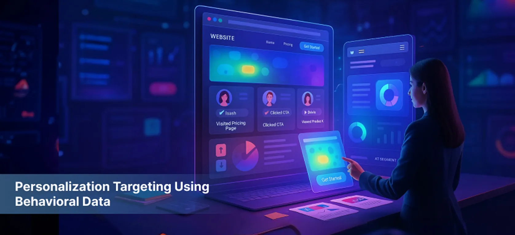
Personalization Targeting Using Behavioral Data
Challenge This client struggled with plateauing conversion rates despite stable traffic volumes. Historical data indicated that their generic messaging failed to engage their multi-faceted audience segments, leading to low conversion efficiency. In fact, A/B tests conducted previously showed that generic landing pages converted at a mere 1.5%, while segmented audiences had a potential conversion rate of over 5%.With a diverse audience base, the lack of tailored messaging resulted in missed opportunities to connect with users on a personal level, ultimately affecting overall sales performance. Approach Visitor's Mind leveraged advanced segmentation techniques, using behavioral and demographic data including geolocation, referral source, device type, and engagement patterns. Based on these signals, dynamic content variations were created using a server-side personalization engine and client-side scripts to tailor headlines, CTAs, and offers in real-time.Experiments were carefully set up with a robust A/B testing framework to compare personalized variants against control groups, with metrics tracked via custom dashboard integrations.This data-driven strategy ensured users were presented with the most relevant messaging aligned to their context, enhancing perceived value and engagement."Delivering contextually relevant content elevated perceived value and connection, compelling visitors to convert at higher rates." Results 45% increase in overall conversion rate within 6 weeks.The targeted personalization framework significantly improved user relevance perception and engagement, translating directly to more leads and sales. Start Your Conversion Optimization Journey CRO Audit
View Case Study
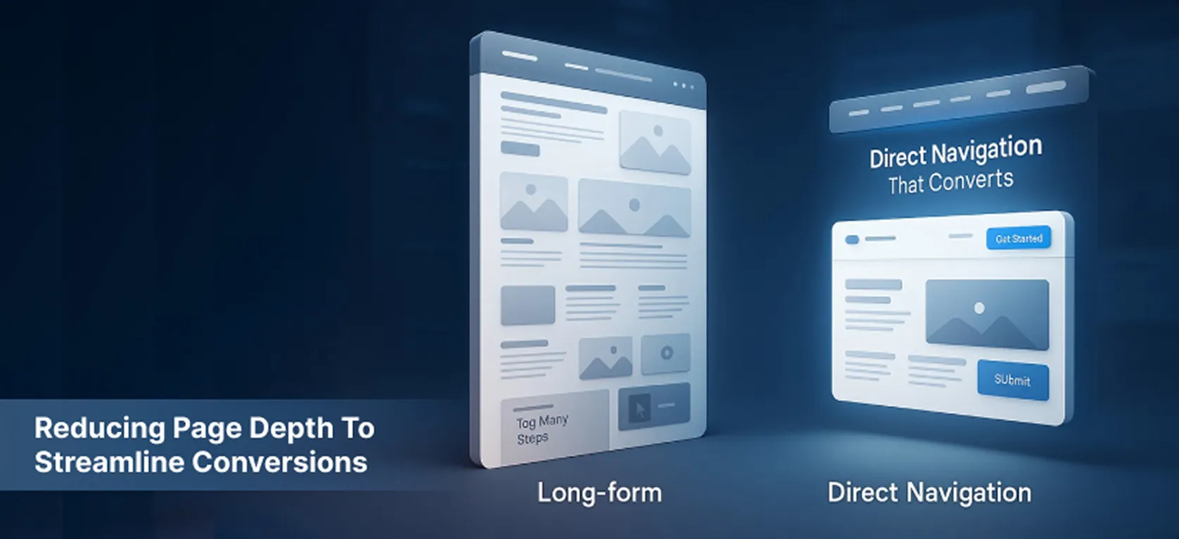
Reducing Page Depth to Streamline Conversions
Challenge Another client’s conversion funnel was spread across multiple deep pages, creating friction as users navigated through a labyrinth of information and multiple clicks before reaching conversion points. Historical analytics indicated that the average user had to click through at least five pages before reaching a conversion point, leading to a high abandonment rate of 45% at the initial stages of the funnel.In-depth analysis revealed that users were overwhelmed by the amount of information presented, resulting in decision fatigue and a lack of clarity on the next steps. This complexity was detrimental to the overall user experience and conversion efficiency. Approach Visitor's Mind performed a comprehensive analysis of user journeys via funnel analytics and clickstream data to identify exact drop-off points. The solution was to reduce page depth by consolidating content and critical CTAs into fewer, well-structured pages.This involved redesigning content architecture to prioritize essential information upfront, using accordion elements and improved visual hierarchy to maintain clarity without overwhelming users.A/B tests compared the existing multi-page funnel against the streamlined layout, monitoring conversion rates, bounce metrics, and time-on-page data.The revised architecture provided a more linear and intuitive user flow, minimizing cognitive load and decision fatigue."Simplifying the funnel was pivotal, making each step feel purposeful and reducing decision fatigue." Results 40% uplift in conversion rate after implementing single and two-page funnels.Streamlining navigation reduced user cognitive load and enabled quicker decision-making, transforming a complex funnel into a high converting user journey.
View Case Study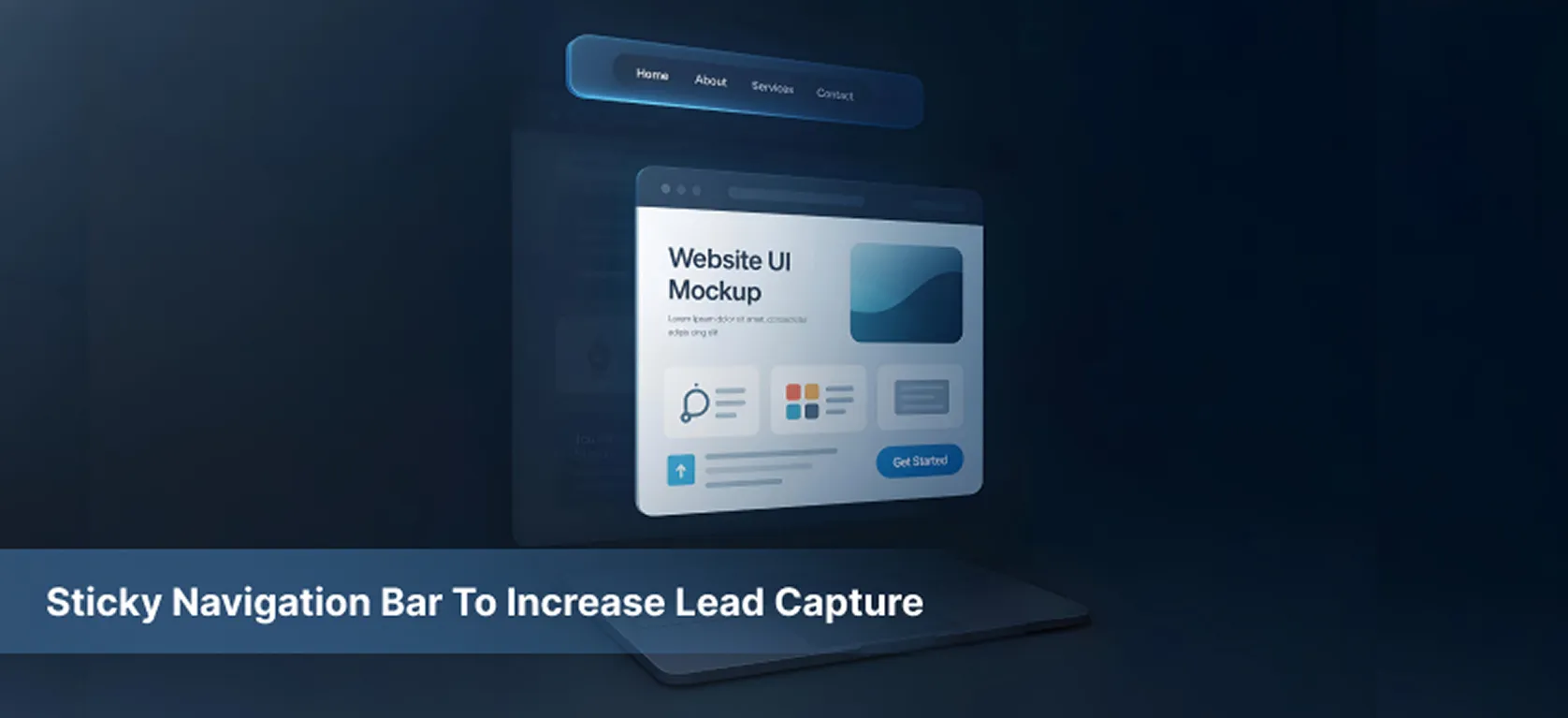
Sticky Navigation Bar to Increase Lead Capture
Challenge Visitor's Mind worked with a leading content-driven website that faced a significant challenge in user engagement. Historical data indicated that over 60% of visitors were abandoning the site after viewing only one page. This high bounce rate was primarily attributed to the website's extensive content layout, which required users to scroll deeply to find relevant information. As users navigated through long articles, the primary navigation elements would disappear, leading to confusion and frustration.In a recent analysis, Visitor's Mind found that the average time spent on the site was only 1 minute and 30 seconds, with a staggering 70% of users failing to interact with any CTAs. This indicated a clear disconnect between user intent and the website's navigational structure. Approach Recognizing the friction caused by disappearing navigation, Visitor's Mind introduced a sticky navigation bar fixed to the top viewport. The team conducted user behavior analysis and visitor heatmap tracking to understand scrolling patterns and ensure critical CTAs remained visible without obstructing content.Multiple sticky header designs were A/B tested, evaluating usability factors such as size, opacity, and button prominence. Visitor's Mind used event tracking to monitor click-through rates on calls-to-action embedded in the sticky bar and measured session duration to gauge user engagement.The approach emphasized minimal invasiveness combined with constant accessibility, enabling visitors to navigate intuitively without losing focus or momentum."Visitors appreciated always having the next step within reach, resulting in an intuitive and seamless browsing experience." Results 33% increase in lead form submissions over 4 weeks.The sticky navigation converted what was previously a frustration point into a continuous guide, improving user experience and significantly boosting lead generation.
View Case Study